Input Sliders
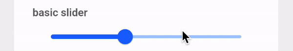
Simple slider
Pass initialValue for initial value, it cannot be less than minimum limit and cannot be greater than maximum limit.
const InputSlider(
    initialValue: 0.8,
),
Set min and max for starting and ending limit, default value of min is 0 and maximum is 1.
const InputSlider(
    initialValue: 50,
    min: 0,
    max: 100,
),
Pass label parameter for setting label. Note: label won't work if steps aren't there, also if you're not passing custom label and steps are there then it will show current value of slider.
const InputSlider(
    initialValue: 0.0,
    step: 0.1,
    label: 'your label',
),
Pass precision value to use that much of precision in all slider calculations and display. When using high precision (let's say greatear than 5), it might give wrong results. The reason for this is floating-point arithmetic and the fact that Dart uses the IEEE 754 standard as far as I am concerned. This happens for all languages that use floating-point arithmetic. General question about floating-point arithmetic in modern programming languages.
const InputSlider(
    initialValue: 0.0,
    step: 0.1,
    precision: 3,
),
Pass activeColor, inactiveColor, and thumbColor for changing appereance of slider.
const InputSlider(
    initialValue: 0.0,
    inactiveColor: Colors.orange.shade200,
    activeColor: Colors.orange,
    thumbColor: Colors.orange,
),
Pass onChanged, onChangeStart, and onChangeEnd functions to perform actions for respective changes.
InputSlider(
    initialValue: 0.8,
    onChanged: (value) => Log.info(value, disableCloudLogging: true),
),
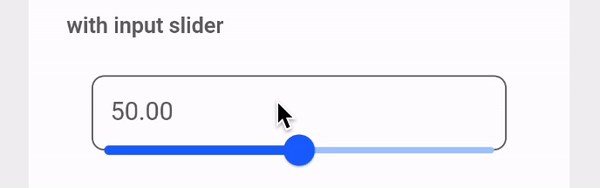
Pass forceInputBox as true to make slider use input field also.
const InputSlider(
    min: 0,
    max: 100,
    initialValue: 50,
    forceInputBox: true,
),
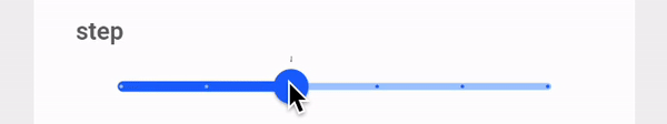
Pass step argument to make slider increase / decrease value in steps only.
const InputSlider(
    min: 0,
    max: 100,
    initialValue: 0,
    step: 20,
),
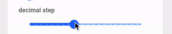
You can pass step arg in decimal points for having decimal steps.
InputSlider(
    min: 0,
    max: 10,
    initialValue: 0.0,
    step: 0.5,
),
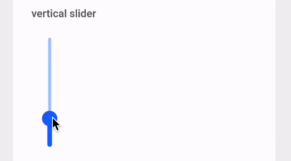
Pass forceVertical as true to make slider vertical.
const InputSlider(
    initialValue: 0,
    forceVertical: true,
),
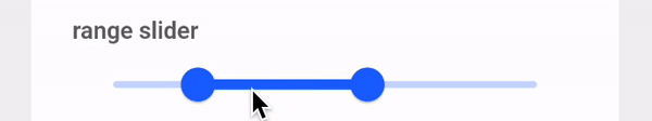
Range slider
Common Properties
For Range Slider, min and max, step, precision, activeColor, inactiveColor, thumbColor properties are same like Simple slider.
Pass initialValues argument to pass initial values, and labels argument to show custom label.
const InputRangeSlider(
    min: 0,
    max: 10,
    step: 1,
    initialValues: RangeValues(0, 1),
    labels: RangeLabels('your starting label', 'your ending label'),
),
onChanged, onChangeStart, onChangeEnd works same like Simple slider, we just get RangeValues back instead of double.
Source Code
import 'package:flutter/material.dart';
import 'package:flutter/services.dart' as services;
import 'package:team/vaahextendflutter/app_theme.dart';
import 'package:team/vaahextendflutter/helpers/constants.dart';
import 'package:team/vaahextendflutter/widgets/atoms/input_text.dart';

class InputSlider extends StatefulWidget {
  final double initialValue;
  final Function(double)? onChanged;
  final Function(double)? onChangeStart;
  final Function(double)? onChangeEnd;
  final double min;
  final double max;
  final double? step;
  final String? label;
  final int? precision;
  final bool forceVertical;
  final bool forceInputBox;
  final Color? activeColor;
  final Color? inactiveColor;
  final Color? thumbColor;

  const InputSlider({
    Key? key,
    required this.initialValue,
    this.onChanged,
    this.onChangeStart,
    this.onChangeEnd,
    this.min = 0.0,
    this.max = 1.0,
    this.step,
    this.label,
    this.precision,
    this.forceVertical = false,
    this.forceInputBox = false,
    this.activeColor,
    this.inactiveColor,
    this.thumbColor,
  }) : super(key: key);

  @override
  State<InputSlider> createState() => _InputSliderState();
}

class _InputSliderState extends State<InputSlider> {
  String? err;
  late double _value;
  String? label;
  int? divisions;
  final TextEditingController controller = TextEditingController();

  @override
  void initState() {
    super.initState();
    _value = widget.initialValue;
    if (_value < widget.min) {
      err = 'Initial value is less than minimum value.';
      return;
    }
    if (_value > widget.max) {
      err = 'Initial value is greater than maximum value.';
      return;
    }
    controller.text = _value.toStringAsFixed(widget.precision ?? AppTheme.precision);
    if (widget.step != null) {
      divisions = (widget.max - widget.min) ~/ widget.step!;
    }
  }

  @override
  Widget build(BuildContext context) {
    return err != null
        ? Padding(
            padding: bottomPadding8,
            child: Text(err!, style: TextStyle(color: AppTheme.colors['danger'])),
          )
        : Builder(
            builder: (context) {
              final SliderTheme slider = SliderTheme(
                data: SliderThemeData(
                  trackShape: TrackShape(),
                ),
                child: Slider(
                  value: _value,
                  onChanged: (value) {
                    setState(() {
                      _value = double.parse(
                        value.toStringAsFixed(widget.precision ?? AppTheme.precision),
                      );
                    });
                    controller.text = _value.toString();
                    if (widget.onChanged != null) {
                      widget.onChanged!(_value);
                    }
                  },
                  onChangeStart: widget.onChangeStart,
                  onChangeEnd: widget.onChangeEnd,
                  min: widget.min,
                  max: widget.max,
                  divisions: divisions,
                  label: widget.label ??
                      _value.toStringAsFixed(widget.precision ?? AppTheme.precision),
                  activeColor: widget.activeColor ?? AppTheme.colors['primary'],
                  inactiveColor: widget.inactiveColor ?? AppTheme.colors['primary']!.shade200,
                  thumbColor: widget.thumbColor ?? AppTheme.colors['primary'],
                ),
              );
              if (widget.forceVertical) {
                return RotatedBox(
                  quarterTurns: -1,
                  child: Column(
                    mainAxisSize: MainAxisSize.min,
                    children: [
                      slider,
                    ],
                  ),
                );
              }
              if (widget.forceInputBox) {
                return Stack(
                  alignment: Alignment.bottomCenter,
                  children: [
                    if (!widget.forceVertical && widget.forceInputBox)
                      Container(
                        margin: verticalPadding24,
                        child: InputText(
                          controller: controller,
                          keyboardType: TextInputType.number,
                          onChanged: (value) {
                            final double updatedValue =
                                (double.tryParse(value) ?? widget.initialValue)
                                    .clamp(widget.min, widget.max);
                            setState(() {
                              _value = updatedValue;
                            });
                          },
                          // TODO: fix to allow negative input
                          inputFormatters: [
                            services.FilteringTextInputFormatter.allow(
                                RegExp(r'^\-?\d+\.?\d{0,2}')),
                          ],
                        ),
                      ),
                    slider,
                  ],
                );
              }
              return slider;
            },
          );
  }
}

class InputRangeSlider extends StatefulWidget {
  final RangeValues initialValues;
  final Function(RangeValues)? onChanged;
  final Function(RangeValues)? onChangeStart;
  final Function(RangeValues)? onChangeEnd;
  final double min;
  final double max;
  final double? step;
  final RangeLabels? labels;
  final int? precision;
  final Color? activeColor;
  final Color? inactiveColor;
  final Color? thumbColor;

  const InputRangeSlider({
    Key? key,
    required this.initialValues,
    this.onChanged,
    this.onChangeStart,
    this.onChangeEnd,
    this.min = 0.0,
    this.max = 1.0,
    this.step,
    this.labels,
    this.precision,
    this.activeColor,
    this.inactiveColor,
    this.thumbColor,
  }) : super(key: key);

  @override
  State<InputRangeSlider> createState() => _InputRangeSliderState();
}

class _InputRangeSliderState extends State<InputRangeSlider> {
  late RangeValues _values;
  RangeLabels? _labels;
  int? divisions;
  String? err;

  @override
  void initState() {
    _values = widget.initialValues;
    if (widget.step != null && (widget.step! < widget.max)) {
      divisions = (widget.max - widget.min) ~/ widget.step!;
    }
    if (_values.start < widget.min || _values.end > widget.max) {
      err = "Failed assertion: 'values.start >= min && values.start <= max': is not true.";
    }
    super.initState();
  }

  @override
  Widget build(BuildContext context) {
    return err != null
        ? Text(err!, style: TextStyle(color: AppTheme.colors['danger']))
        : SliderTheme(
            data: SliderThemeData(
              rangeTrackShape: RangeTrackShape(),
            ),
            child: RangeSlider(
              values: _values,
              onChanged: (values) {
                setState(() {
                  _values = RangeValues(
                    double.parse(
                        values.start.toStringAsFixed(widget.precision ?? AppTheme.precision)),
                    double.parse(
                        values.end.toStringAsFixed(widget.precision ?? AppTheme.precision)),
                  );
                  _labels = RangeLabels(
                    _values.start.toStringAsFixed(widget.precision ?? AppTheme.precision),
                    _values.end.toStringAsFixed(widget.precision ?? AppTheme.precision),
                  );
                });
                if (widget.onChanged != null) widget.onChanged!(_values);
              },
              onChangeStart: widget.onChangeStart,
              onChangeEnd: widget.onChangeEnd,
              min: widget.min,
              max: widget.max,
              labels: widget.labels ?? _labels,
              activeColor: widget.activeColor,
              inactiveColor: widget.inactiveColor,
              divisions: divisions,
            ),
          );
  }
}

class TrackShape extends RoundedRectSliderTrackShape {
  @override
  Rect getPreferredRect({
    required RenderBox parentBox,
    Offset offset = Offset.zero,
    required SliderThemeData sliderTheme,
    bool isEnabled = false,
    bool isDiscrete = false,
  }) {
    final trackHeight = sliderTheme.trackHeight;
    final trackLeft = offset.dx;
    final trackTop = offset.dy + (parentBox.size.height - trackHeight!) / 2;
    final trackWidth = parentBox.size.width;
    return Rect.fromLTWH(trackLeft, trackTop, trackWidth, trackHeight);
  }
}

class RangeTrackShape extends RoundedRectRangeSliderTrackShape {
  @override
  Rect getPreferredRect({
    required RenderBox parentBox,
    Offset offset = Offset.zero,
    required SliderThemeData sliderTheme,
    bool isEnabled = false,
    bool isDiscrete = false,
  }) {
    final trackHeight = sliderTheme.trackHeight;
    final trackLeft = offset.dx;
    final trackTop = offset.dy + (parentBox.size.height - trackHeight!) / 2;
    final trackWidth = parentBox.size.width;
    return Rect.fromLTWH(trackLeft, trackTop, trackWidth, trackHeight);
  }
}