Buttons
Button Types
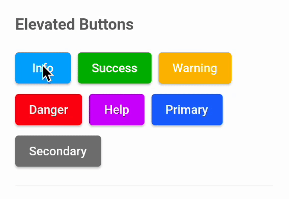
We support Elevated buttons, Outlined buttons, Text buttons, and Icon Buttons.
Button sub types
button sub types depending on the use-case. As of now we support 7 sub types of buttons.
- Primary,
- Secondary,
- Info,
- Success,
- Danger,
- Warning,
- Help.
Precedents
- if style attribute is passed, then it will precedent all the other properties related to appereance.
- When buttonType and backgroundColor both properties are used, backgroundColor will take Precedent over buttonType.
Elevated Button
We have two required properties. onPressed and text.
ButtonElevated(
    onPressed: () {},
    text: "Button",
),
How to apply custom style?
ButtonElevated(
    onPressed: () {},
    text: "Custom style",
    style: ElevatedButton.styleFrom(
        backgroundColor: Colors.white,
        foregroundColor: Colors.black,
    ),
),
How to apply buttonType?
ButtonElevated(
    onPressed: () {},
    text: "Info",
    buttonType: ButtonType.info,
),
How to apply custom background and foreground colors?
ButtonElevated(
    onPressed: () {},
    text: "Color",
    backgroundColor: Colors.white,
    foregroundColor: Colors.black,
),
Changing Border Radius
ButtonElevated(
    onPressed: () {},
    text: "Border Radius",
    borderRadius: 100,
),
Changing Padding
ButtonElevated(
    onPressed: () {},
    text: "Padding",
    padding: horizontalPadding32 + verticalPadding12,
),
Changing font size
ButtonElevated(
    onPressed: () {},
    text: "font size",
    fontSize: 10,
),
Outlined Button
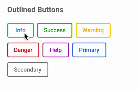
We have same properties like elevated button for outlined button. onPressed, text, style, buttonType, foregroundColor, fontSize, borderRadius, padding.
example:
ButtonOutlined(
    onPressed: () {},
    text: "Info",
    buttonType: ButtonType.info,
),
Text Button
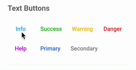
We have same properties like elevated button for text button. onPressed, text, style, buttonType, foregroundColor, fontSize, borderRadius, padding.
example:
ButtonText(
    onPressed: () {},
    text: "Info",
    buttonType: ButtonType.info,
),
Icon Button
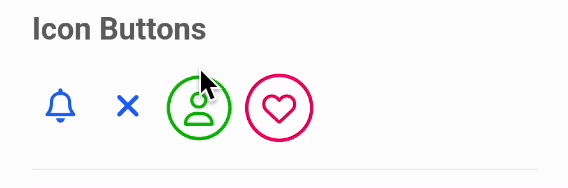
We have some properties like elevated button for icon button. onPressed, buttonType, borderRadius, padding.
We have some new properties like iconData, color, iconSize, enableBorder.
How to use icon data?
ButtonIcon(
    onPressed: () {},
    iconData: FontAwesomeIcons.heart,
),
How to use color?
ButtonIcon(
    onPressed: () {},
    color: Colors.pink,
    iconData: FontAwesomeIcons.heart,
),
How to change icon size?
ButtonIcon(
    onPressed: () {},
    color: Colors.pink,
    iconData: FontAwesomeIcons.heart,
    iconSize: 30,
),
How to enable/ disable border?
ButtonIcon(
    onPressed: () {},
    iconData: FontAwesomeIcons.heart,
    enableBorder: false,
),
Buttons with icons
Elevated Button With Icon
We have two extra properties for ButtonElevatedWithIcon than ButtonElevated. Using those (leading and iconSize) we can have icon/asset as icon & change its appearance.
ButtonElevatedWithIcon(
    onPressed: () {},
    text: "Icon Button",
    leading: const Icon(FontAwesomeIcons.user),
    iconSize: 22,
),
Outlined Button With Icon
We have two extra properties for ButtonOutlinedWithIcon than ButtonOutlined. Using those (iconData and iconSize) we can change icon appereance.
ButtonOutlinedWithIcon(
    onPressed: () {},
    text: "Icon Button",
    iconData: FontAwesomeIcons.user,
    iconSize: 22,
),
Text Button With Icon
We have two extra properties for ButtonTextWithIcon than ButtonText. Using those (leading and iconSize) we can have icon as icon/asset & change its appearance.
ButtonTextWithIcon(
    onPressed: () {},
    text: "Icon Button",
    leading: const Icon(FontAwesomeIcons.user),
    iconSize: 22,
),