Atoms
Input Date and Time
How to use?
label is mandatory property.
Use isEnabled to enable/ disable field.
const InputDateTime(
    label: 'Choose Date',
    isEnabled: false,
),
Use size to change size of field. valid values are: enum InputSize { extraSmall, small, medium, large, extraLarge }
const InputDateTime(
    label: 'Choose Date',
    size: InputSize.large,
),
Use iconBackgroundColor and iconColor to icon appearence.
const InputDateTime(
    label: 'Choose Date',
    iconBackgroundColor: Colors.pink,
    iconColor: Colors.white,
),
Use callback to get selected value.
InputDateTime(
    label: 'Choose Date',
    callback: (value) {
        print(value);
    },
),
use validator and autoValidateMode to validate values.
InputDateTime(
    label: 'Validator',
    validator: (value) {
        if (value!.isEmpty) return 'Invalid Value';
        return null;
    },
    autoValidateMode: AutovalidateMode.always,
),
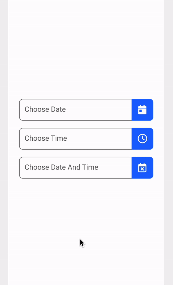
We majory have three kind of datetime inputs: Date Only, Time Only, and Date & Time Only
Date Only
InputDateTime(
    label: 'Choose Date',
    pickerType: PickerType.dateOnly,
    callback: (date) {
        if (date is DateTime) Log.info(date, disableCloudLogging: true);
    },
),
Time Only
InputDateTime(
    label: 'Choose Time',
    pickerType: PickerType.timeOnly,
    callback: (time) {
        if (time is TimeOfDay) Log.info(time, disableCloudLogging: true);
    },
),
Date and Time Both
InputDateTime(
    label: 'Choose Date And Time',
    pickerType: PickerType.dateAndTime,
    callback: (datetime) {
        if (datetime is DateTime) Log.info(datetime, disableCloudLogging: true);
    },
),
Source Code
import 'package:flutter/material.dart';
import 'package:font_awesome_flutter/font_awesome_flutter.dart';

import '../../app_theme.dart';
import '../../helpers/constants.dart';
import '../../helpers/date_time.dart';
import '../../helpers/enums.dart';
import '../../services/logging_library/logging_library.dart';

enum PickerType { dateOnly, timeOnly, dateAndTime }

typedef ValidatorFun = String? Function(String?);

class InputDateTime extends StatefulWidget {
  final String label;
  final EdgeInsets padding;
  final double borderRadius;
  final bool isEnabled;
  final InputSize size;
  final PickerType pickerType;
  final DateTime? initialDateTime;
  final DateTime? firstDate;
  final DateTime? lastDate;
  final Color? iconBackgroundColor;
  final Color? iconColor;
  final AutovalidateMode? autoValidateMode;
  final ValidatorFun? validator;
  final Function(dynamic)? callback;

  const InputDateTime({
    super.key,
    required this.label,
    this.padding = allPadding12,
    this.borderRadius = defaultPadding / 2,
    this.isEnabled = true,
    this.size = InputSize.medium,
    this.pickerType = PickerType.dateOnly,
    this.initialDateTime,
    this.firstDate,
    this.lastDate,
    this.iconBackgroundColor,
    this.iconColor,
    this.autoValidateMode,
    this.validator,
    this.callback,
  });

  @override
  State<InputDateTime> createState() => _InputDateTimeState();
}

class _InputDateTimeState extends State<InputDateTime> {
  DateTime? date;
  TimeOfDay? time;
  final controller = TextEditingController();

  @override
  Widget build(BuildContext context) {
    return TextFormField(
      onTap: select,
      decoration: InputDecoration(
        contentPadding: widget.padding,
        border: border(AppTheme.colors['black']!.shade400),
        enabledBorder: border(AppTheme.colors['black']!.shade400),
        disabledBorder: border(AppTheme.colors['black']!.shade300),
        focusedBorder: border(AppTheme.colors['black']!.shade400),
        errorBorder: border(AppTheme.colors['danger']!.shade400),
        focusedErrorBorder: border(AppTheme.colors['danger']!.shade400),
        errorStyle: TextStyle(color: AppTheme.colors['danger']!.shade400),
        hintText: widget.label,
        hintStyle: TextStyle(
          fontSize: getFontSize(),
          color: widget.isEnabled
              ? AppTheme.colors['black']!.shade400
              : AppTheme.colors['black']!.shade300,
        ),
        suffixIcon: InkWell(
          onTap: select,
          child: Container(
            decoration: BoxDecoration(
              borderRadius: BorderRadius.only(
                topRight: Radius.circular(widget.borderRadius),
                bottomRight: Radius.circular(widget.borderRadius),
              ),
              color: widget.iconBackgroundColor ?? AppTheme.colors['primary'],
            ),
            child: Column(
              mainAxisAlignment: MainAxisAlignment.center,
              children: [
                FaIcon(
                  asset(),
                  size: getFontSize() * 1.3,
                  color: widget.iconColor ?? AppTheme.colors['white'],
                ),
              ],
            ),
          ),
        ),
      ),
      controller: controller,
      style: TextStyle(
        fontSize: getFontSize(),
        color: AppTheme.colors['black']!.shade400,
      ),
      enabled: widget.isEnabled,
      readOnly: true,
      validator: widget.validator,
      autovalidateMode: widget.autoValidateMode,
    );
  }

  OutlineInputBorder border(Color color) {
    return OutlineInputBorder(
      borderRadius: BorderRadius.circular(widget.borderRadius),
      borderSide: BorderSide(
        width: 1,
        color: color,
      ),
    );
  }

  double getFontSize() {
    switch (widget.size) {
      case InputSize.extraSmall:
        return AppTheme.extraSmall;
      case InputSize.small:
        return AppTheme.small;
      case InputSize.large:
        return AppTheme.large;
      case InputSize.extraLarge:
        return AppTheme.extraLarge;
      default:
        return AppTheme.medium;
    }
  }

  IconData asset() {
    switch (widget.pickerType) {
      case PickerType.dateOnly:
        return FontAwesomeIcons.calendarDay;
      case PickerType.timeOnly:
        return FontAwesomeIcons.clock;
      case PickerType.dateAndTime:
        return FontAwesomeIcons.calendarXmark;
      default:
        return FontAwesomeIcons.circleExclamation;
    }
  }

  void select() async {
    switch (widget.pickerType) {
      case PickerType.dateOnly:
        await datePicker();
        if (date != null) {
          controller.text = date!.toFullDateString;
        } else {
          controller.text = '';
        }
        if (widget.callback != null) widget.callback!(date);
        break;
      case PickerType.timeOnly:
        await timePicker();
        if (time != null) {
          controller.text = time!.toHMaa;
        } else {
          controller.text = '';
        }
        if (widget.callback != null) widget.callback!(time);
        break;
      case PickerType.dateAndTime:
        await datePicker();
        if (date != null) {
          await timePicker();
        }
        if (date == null || time == null) {
          controller.text = '';
          if (widget.callback != null) widget.callback!(null);
        } else {
          final DateTime datetime =
              DateTime(date!.year, date!.month, date!.day, time!.hour, time!.minute);
          controller.text = datetime.toFullDateTimeString;
          if (widget.callback != null) widget.callback!(datetime);
        }
        break;
      default:
        Log.exception('Error in date time input', disableCloudLogging: true);
    }
  }

  Future<void> datePicker() async {
    date = await showDatePicker(
      context: context,
      initialDate: widget.initialDateTime ?? DateTime.now(),
      firstDate: widget.firstDate ?? DateTime(2000),
      lastDate: widget.lastDate ?? DateTime(2050),
    );
    return;
  }

  Future<void> timePicker() async {
    time = await showTimePicker(
      context: context,
      initialTime: TimeOfDay.fromDateTime(
        widget.initialDateTime ?? DateTime.now(),
      ),
    );
    return;
  }
}